
branding case study: clutch consulting
what we did for
clutch consulting
When Ellen from Clutch Consulting came to us, her goal was clear: to create a brand that reflected the dynamic, non-linear nature of business transformation and growth.
Our task was to design an identity that would encapsulate this essence while appealing to both young entrepreneurs and the corporate landscape.
-
Using our Brand Name Workshop, we crafted a unique, memorable name that captures the essence of the business. Through discovery, brainstorming, and testing, we developed a name that resonates with the target audience and sets the brand apart.
-
Our Brand Positioning & Strategy service defined Clutch Consulting's unique market position. We explored core values, target audiences, and the competitive landscape to craft a clear, compelling strategy that sets the business apart and drives growth.
-
Building on this, our The Whole Shebang Branding Package developed a cohesive identity that reflects their vision. From logo design to colour palettes and typography, we shaped every detail to ensure the brand stands out, connects with the audience, and tells their story clearly.
-
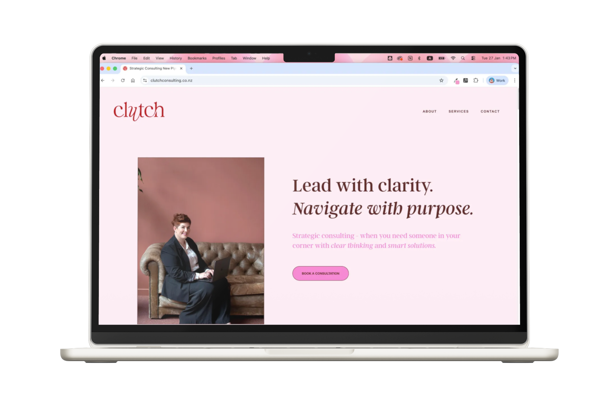
Then we helped launch Clutch Consulting out into the world with:
Business cards
Proposal document design
Email setup
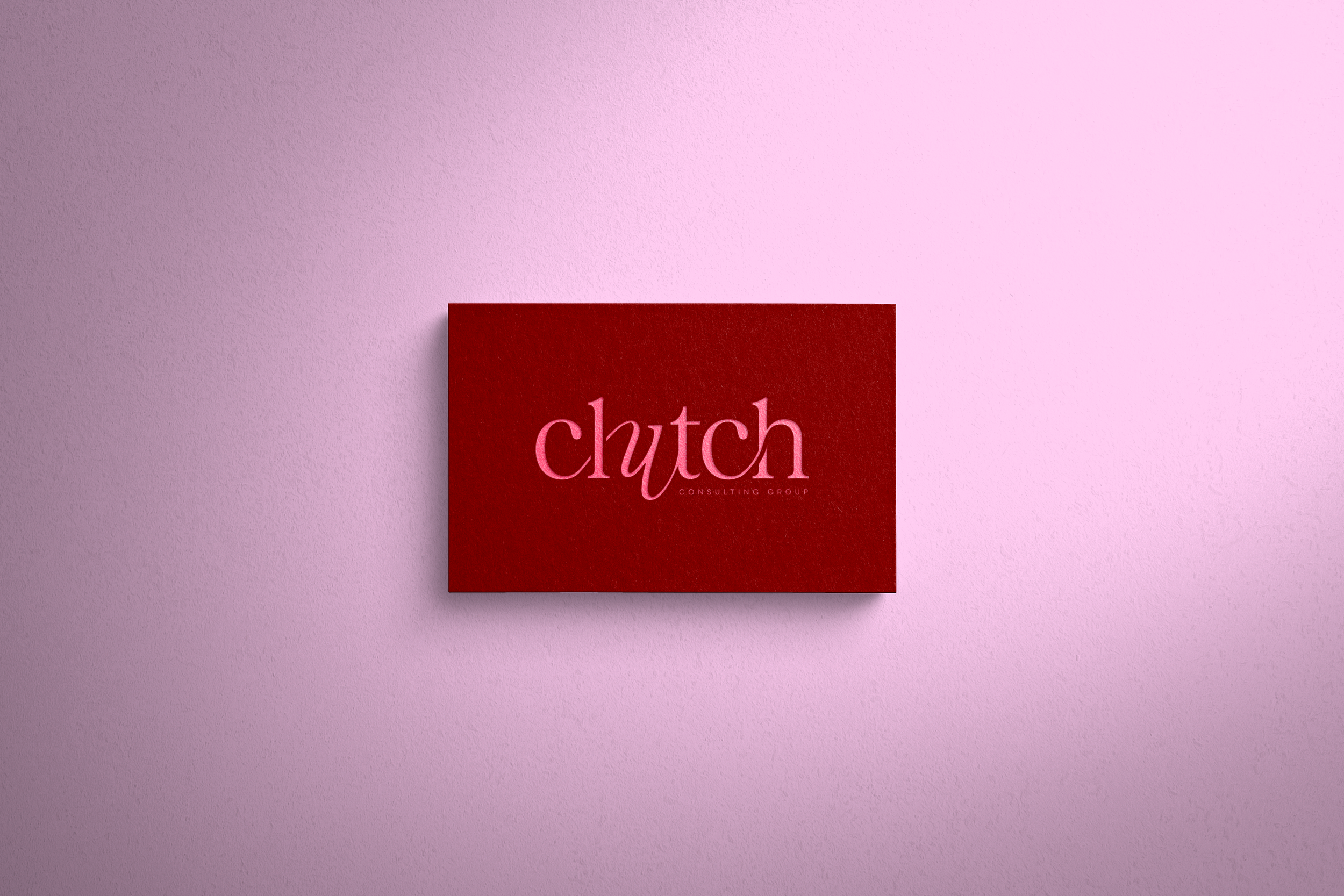
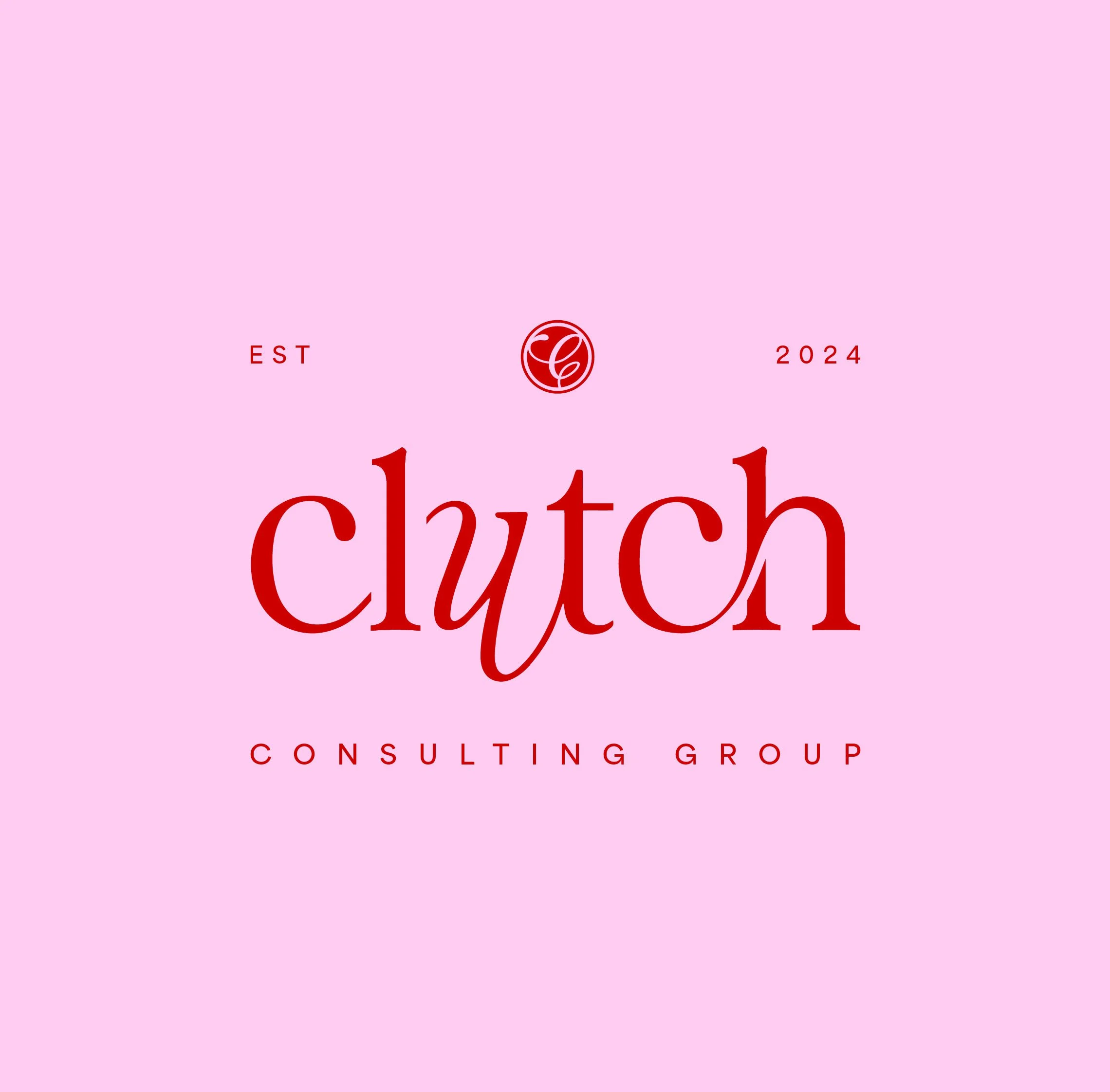
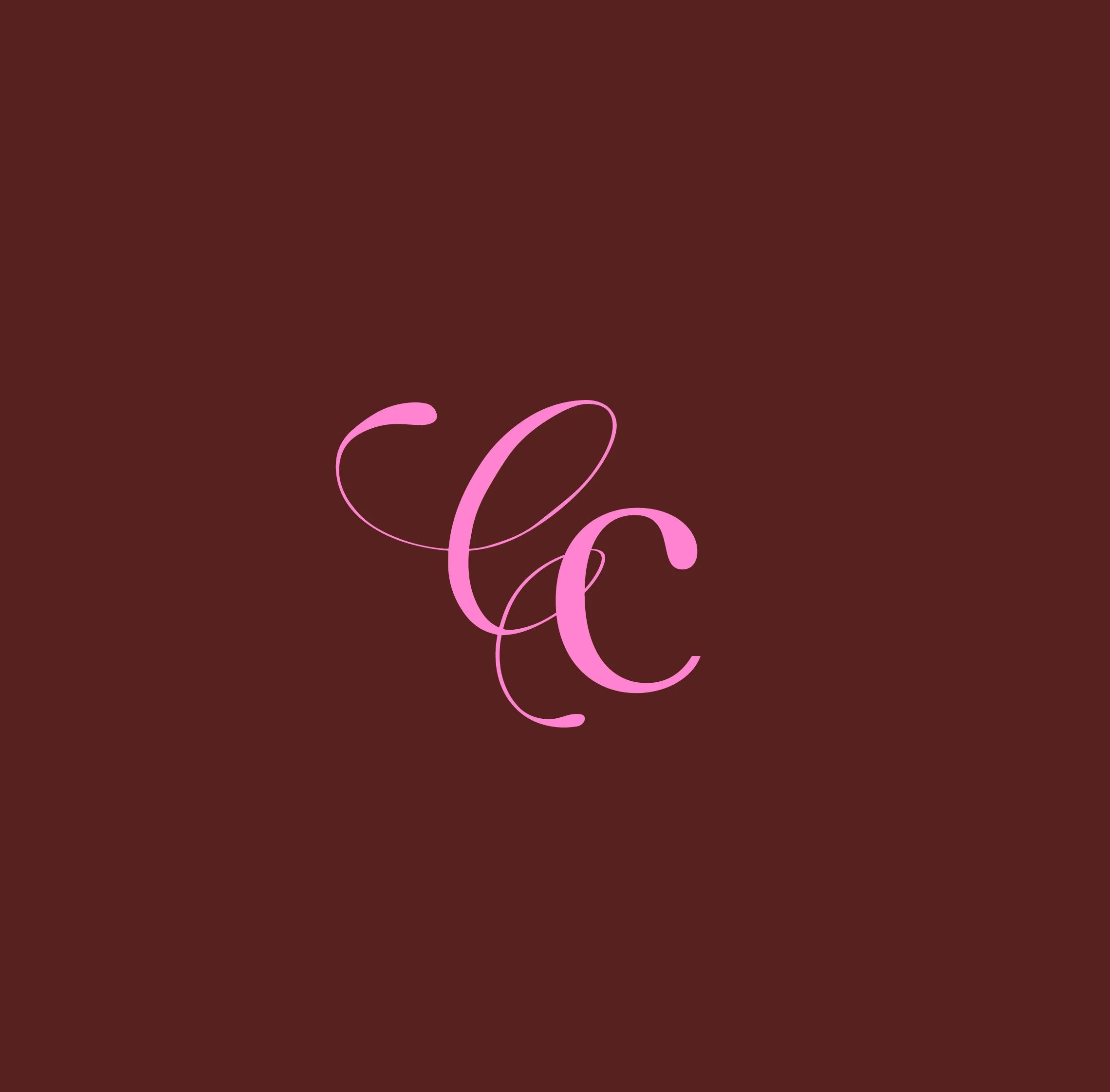
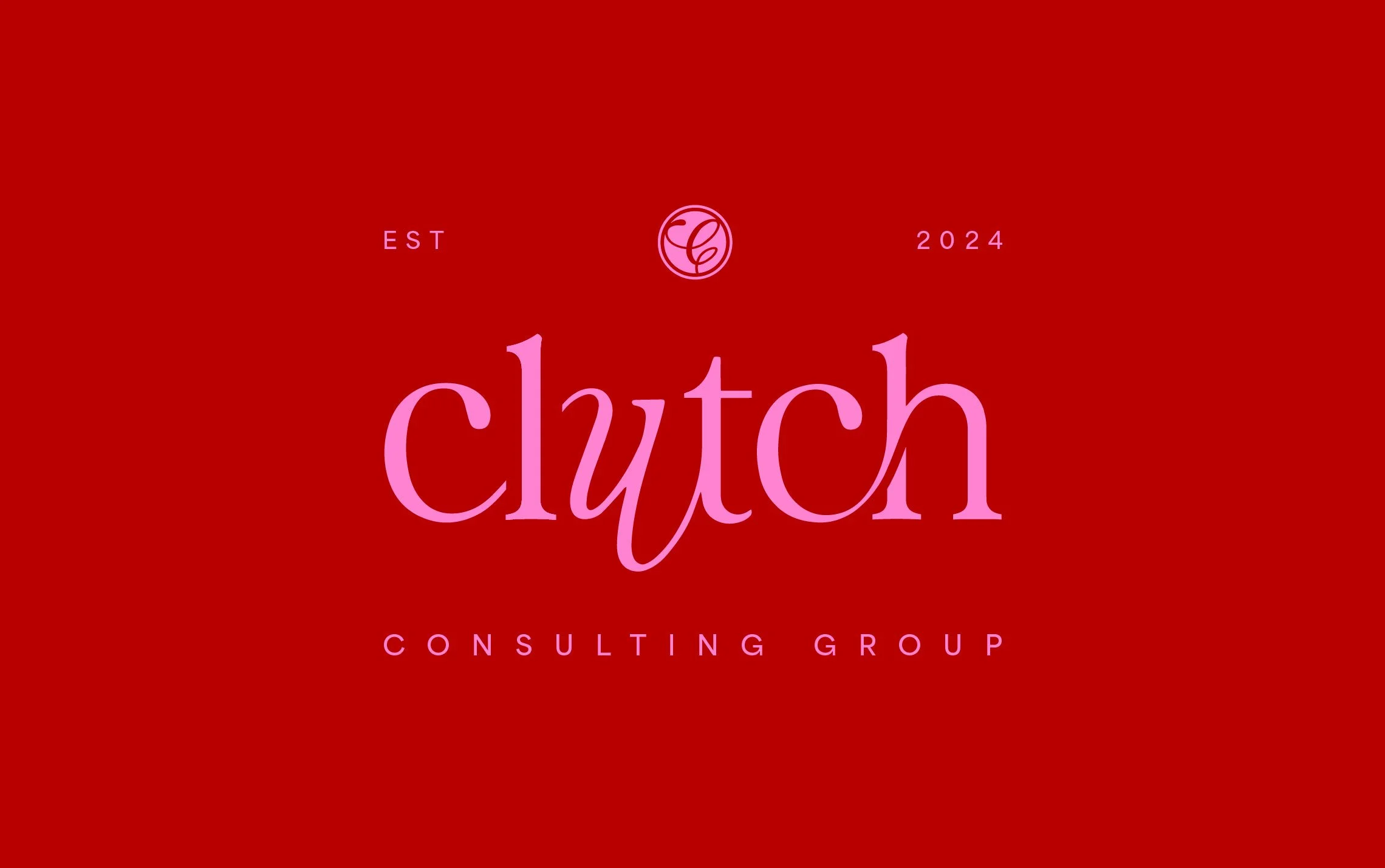
We began our journey by creating Clutch’s memorable logo – understanding their brand personality, values and mission were critical components to designing a logo that not only encapsulates all their brand embodies but resonates with their target audience.
The flowing nature of their logo conveyed through sweeping strokes represents fluidity and movement — key elements of their work. The organic balance between sophistication and swiftness reflects their approachable yet professional nature when collaborating with clients. Balanced negative space was used to mirror the interconnectedness that businesses undergo, aligning perfectly with Clutch’s mission to bring clarity to complex processes.
colour palette
The component that truly brings a brand to life – the tool that evokes emotion whilst conveying the brand’s personality, mood and values.
Energetic reds were central to Clutch’s brand identity, representing the vibrancy, passion and energy of Clutch Consulting. We layered in a brown tone to provide a grounding touch, bringing sophistication and balancing the boldness of the pinks— the blend of these elegant, luxurious colours created a palette that compliments and identifies the voice of Clutch Consulting.
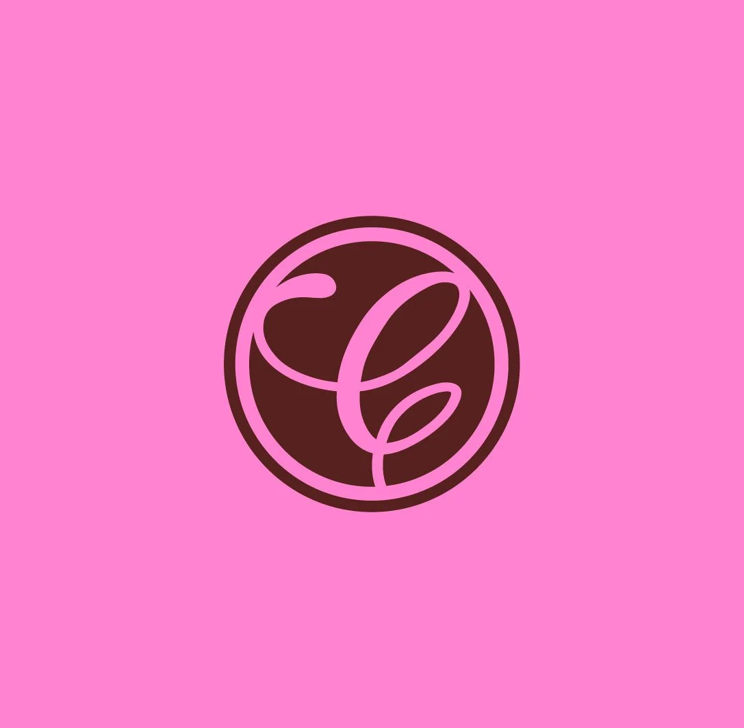
typography
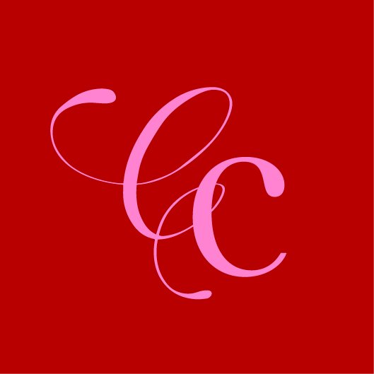
and monogram
The element that transforms a brand's message into a visual experience and enhances the brand's personality.
We chose a combination of contemporary and timeless fonts, these harmonised to create a brand that feels both modern and enduring. The custom "Clutch Consulting" monogram, designed with winding lines, symbolises the whirlwind nature of business, with Clutch at the centre bringing order and clarity
Keen to know more?

Unlock your business's full potential! Schedule your no-obligation, free 30-minute meeting with our branding expert, Rose, to discover how nailing your branding can level up your business.
